< SHOPWARE FRONTEND EDITING />

Learn here how to use the Frontend Editor

This step-by-step guide describes how to fill pages with content using the Frontend Editor. Each step introduces you to a function of the Frontend Editor. Study this guide to become familiar with all the features of the Frontend Editor.

Before your start, make sure that the Frontend Editing Plugin is correctly installed and activated in your Shopware.

If you are a developer and would like to make technical enhancements, please read the Developer's Guide.

< Create content page />

You can create content pages simply by creating regular shop pages. Click on "Content > Shop pages". Then click on the "New Page" button and enter "hello" as the title. Now assign the group "In progress" and scroll to the area "Free text fields".

The Frontend Editing Plugin has created the following fields for you:
  • No breadcrumb: Controls whether the breadcrumb navigation should be displayed on the shop page
  • No headline: Controls whether the title should be displayed on the shop page
  • No sidebar: Controls whether the sidebar should be displayed on the shop page
  • Hide recently seen articles: Controls whether the last viewed articles should be displayed on the shop page
  • Full screen size: Controls whether the shop page should be displayed over the entire page area

In this example we only activate the checkbox "No sidebar". Then click save.

Info: These configuration options are also available for categories.

< Frontend Editor />

Open the Frontend Editor via the menu entry "Content > Frontend Editing".

Within the Frontend Editor, you can navigate through your Shopware frontend, as with a regular browser.

Click in the address bar of the Frontend Editor and enter /hello and press the Enter key to navigate to the previously created shop page.

When the page is loaded, you will see two grey framed rectangular areas. These areas are so-called content areas that can be filled with content elements.

Caution: If you do not see these content areas, it may be due to a bad HTTP cache configuration (please read the installation instructions of the Frontend Editing Plugin). If the problem still exists with a proper HTTP cache configuration, it's most likely that you have a custom Shopware theme, which does not use the standard Shopware Smarty blocks. Ask your developer to customize the theme accordingly. Technical informations can be found in the Developer's Guide.

In addition to shop pages, you will also find these content areas by default on category pages, product detail pages and the start page.

< Content elements />

To create a new content element, click on the "Content elements" button in the lower left corner. A list of all available content elements appears. Press the left mouse button on the text element while holding down the mouse button. The list of content elements disappears and you can now move the element to one of the content areas. Move over a content area so that it turns blue. The green marker shows you at which position the content element will be placed. Now release the mouse button to place the text element.

Tip: Shop pages have two content areas by default. If you have entered text on the shop page via the Shopware backend, the Shopware text appears between these two content areas. In this way you can determine whether the content elements should be displayed before or after the Shopware text.

To edit the text of the text element, simply double-click on the placed text element. The text can now be edited and formatted. To exit text editing mode, click the checkmark icon in the top right corner, or just click anywhere outside the text element.

Each content element has different configuration options. For example, for the text element, you can configure the text color. To do this, click on the placed text element with a simple click. The configuration menu will appear where you can select one of the text colors.

< Breakpoints />

Within the Frontend Editor, you can switch between different breakpoints at any time. So you can always check what your content page would look like on smartphones or tablets. Below the address line of the Frontend Editor, you will find a tab for each breakpoint that you can click to toggle between the different breakpoints. The "Auto" tab does not represent a breakpoint, but automatically adjusts the preview to the size of your browser's window.

You can configure the behavior of content elements for each breakpoint individually. Click again with a simple click on the placed text element. At the bottom of the configuration menu you will also see a tab for each breakpoint. Scroll to the "Mobile Portrait" tab and click it. Activate the checkbox "Hidden" in the "Visibility" section and close the configuration menu. Switch between the different breakpoints within the Frontend Editor. You will see that the text element is no longer displayed in the "Mobile Portrait" breakpoint.

It depends on the content element which breakpoint-specific configuration options are available.

< Column layout />

With the column layout element, content elements can be arranged in multiple columns. You can arrange two, three, four or six content elements next to each other.

Place a new column layout element in a content area. Now you can see that the column layout element contains two separate content areas. Insert a text element in the right column and an image element in the left column. To get a space between the two elements, click once on the placed column layout element to open the configuration menu. In the section "Column spacing" you can now choose between different column spacings (S, M, L, XL or none).

< Images and quick preview />

Newly placed image elements are pre-filled with a placeholder image. To replace this placeholder image, click once on the previously placed image element to open the configuration menu. Click on the large button in the "Image" section to open the Media Manager. Here you can select an image from your Shopware media. Click on a directory and choose an image of your choice. The placeholder image will now be replaced by the selected image.

Images can also be uploaded directly via the Media Manager, if you are in a directory.

Good to know: The images are loaded device-specific depending on your Shopware thumbnail configuration. For example, when the page is accessed from a smartphone, the smallest possible thumbnail is loaded to save data volume. On devices with large screens, the largest possible thumbnail is loaded.

If the images appear blurry, you'll need to adjust the thumbnail configuration for that image album to generate thumbnails that are large enough for each screen resolution (e. g. 320x320, 640x640, 1280x1280 and 1920x1920). Learn more about the Shopware thumbnail configuration here.

To get an accurate impression of your built page, click on the eye icon in the upper right corner. This activates the quick preview and hides all guides. When quick preview is enabled, you will see the actual state of your page. In the quick preview, content elements can not be reconfigured and moved, but behave as they would behave in the Shopware frontend. Click again on the eye icon to go back to edit mode.

< Responsive Design />

The column layout element allows you to make your content elements responsive.
Click on the placed column layout element to open the configuration menu. Click on the "Mobile Landscape" tab at the bottom of the configuration menu. Then select "1 Column (100%)" in the "Columns" section. Now, for all breakpoints that are smaller than "Mobile Landscape", the column layout element is displayed as a single column. In the Frontend Editor, click through the breakpoints to test the behavior of the column element.

< Button element />

Even call-to-action buttons are easy to create. Drag a new button element into a content area. By double-clicking the button, you can edit the button text. In the configuration menu you can define the link target and the appearance of the button.

< Speichern und Seitenvorschau />

Click the three-dot icon in the upper-right corner of the Frontend Editor to open the action menu. Then click on "Save".

Info: Whenever you save without publishing, your changes will not affect the Shopware frontend.

To get a real impression of your current working status, click on "Open URL in new tab" in the action menu.

Since you have not published anything yet, you will now see a page preview of your last saved working status. Via the bar at the bottom of the page, you can deactivate the page preview. If you deactivate the page preview, you will see the actual state of the page.

< Save and page preview />

You can publish your current working status in the action menu by clicking on "Save and publish". Open the action menu again and click on "Open URL in new tab".

Now that you've published your content, you no longer see the page preview, but you are now seeing the actual state of the page, which is now visible to everyone.

< Save and publish />

Every time you save, a new version of your working status is created. This means that you can always revert your working status to a earlier version.
To do this, click on "Versions" in the action menu. Here you can see all versions of the current page. For each version you can see when and by whom it was created. The blue checkmark indicates which version is currently published. The arrow on the right opens the version preview. By clicking on the version itself, you revert your working status to the clicked version. Click on a version and then on "Confirm". You will now see that your working status has been reverted.

< Import/Export />

If your shop is available in another language, you do not need to re-create the content manually, but you can easily import the contents. In the Frontend Editor, go to your language and make sure you are still on the hello page. Then click on "Import" in the action menu. In the following dialog click on the tab "From Shop" and select the shop from which you want to import the contents. Click on "Confirm" to import the contents. You can now translate the texts of the imported content elements. Click on "Save" in the action menu to save your content for the language shop.

Tip: Of course, you can also add or delete new content elements in your language shop. This way you can create completely individual content pages for your language shop.

common.importExportBody2

Tip: You can export your contents to a file in the action menu via the menu entry "Export". You can import this file as you like. Thus, content can be imported on other sites or even in other Shopware systems.

< Example: Landing Page />

Below is an example landing page created with the Frontend Editor.

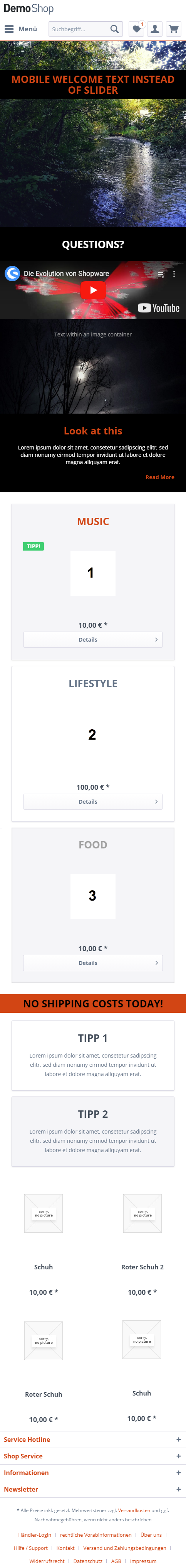
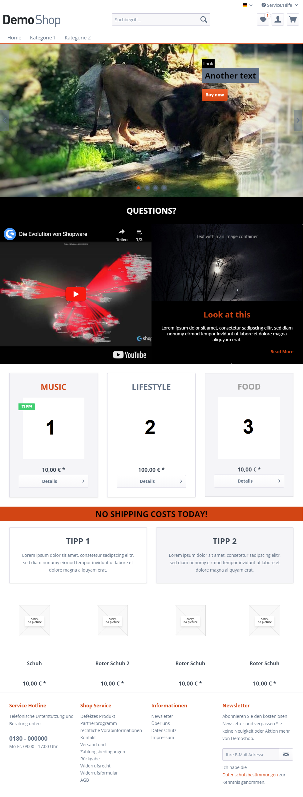
The landing page starts with a carousel element. The carousel element was filled with an image container element, for which the lion's photo was set. A two-column (66%/33%) column layout element has been placed in the lion image container element. In the right column, color container elements were placed, which in turn were filled with text elements and headline elements in order to ensure a high contrast between the text and the lion's photo. Finally, a button element was placed after the color container elements. The first color container element has also been configured with an individual margin top for each breakpoint so that the lion's head will not be covered in any breakpoint. For the breakpoints "Mobile Landscape" and "Mobile Portrait", the visibility of the carousel element was set to "hidden". Instead, the mobile breakpoints simply display an alternate image container element.

The next block consists of a black color container element, which contains a headline element and a two-column column layout element. The left column was filled with a YouTube element and the right column was filled with an image container element and multiple text elements. Notice how the YouTube element in the default configuration automatically adjusts the height to the height of the right column. The column layout element has been configured as a single column for the mobile breakpoints.

The next block consists of a three-column column layout element, where each column has been filled with a panel element. In each panel element a headline element and a product teaser element were placed.
Then an orange color container element was placed, which includes a headline element. Next comes a two-column column layout element filled with two panel elements. The panel elements were filled with headline and text elements.

The landing page was completed with a product list element, which displays four products from a product stream.

Tablet Portrait

Landingpage Tablet Portrait

Mobile Landscape

Landingpage Mobile Landscape